Short answer
How do you add a brand logo grid?
Upload a logo for each brand
In the app, add a logo to each brand. Logos can be PNG, JPG, WEBP or GIF up to 5 MB, and they are saved in your own Shopify Files, so they load from Shopify itself rather than from an outside service.
If it does not work
The upload fails with a message asking you to close and reopen the app. That is Shopify asking you to approve the permission that lets the app save files to your store, and the upload works straight after.
On the free plan, brands past the 30-brand cap are locked for editing, so spend your first hour on the ones actually showing on the page.
How to undo it
Replace a logo by uploading another over it, or remove it and let the fallback chain take that tile back to the collection image or a letter tile.
Pick the Image cards or Logo wall layout
In the theme editor, set the Brand Page block's layout preset. Image cards shows each logo in a card with the brand name under it; Logo wall shows the logos on their own, borderless and without names.
If it does not work
Logo wall looks cleaner in the editor and then hides the brand names on a catalogue where half your logos are abstract marks nobody recognises. If a shopper has to guess which brand a tile is, that is the layout telling you to use Image cards.
How to undo it
Both are one-click presets, so switching back is one click and a save.
Set columns and styling
Choose 2 to 6 columns on desktop and 1 to 4 on mobile, and recolor the square behind each logo to match your theme. Every logo is scaled to fit its square, so logos of different shapes still line up.
If it does not work
Three or four columns on mobile leaves each logo roughly as wide as a thumb, and wide wordmarks become unreadable. Desktop and mobile are set separately for exactly this reason. Look at the page on your own phone before you call it finished.
How to undo it
The theme editor's undo button reverses unsaved changes. Once you save, undo is gone, so the way back is to set the numbers again.
Save, and gaps fill themselves
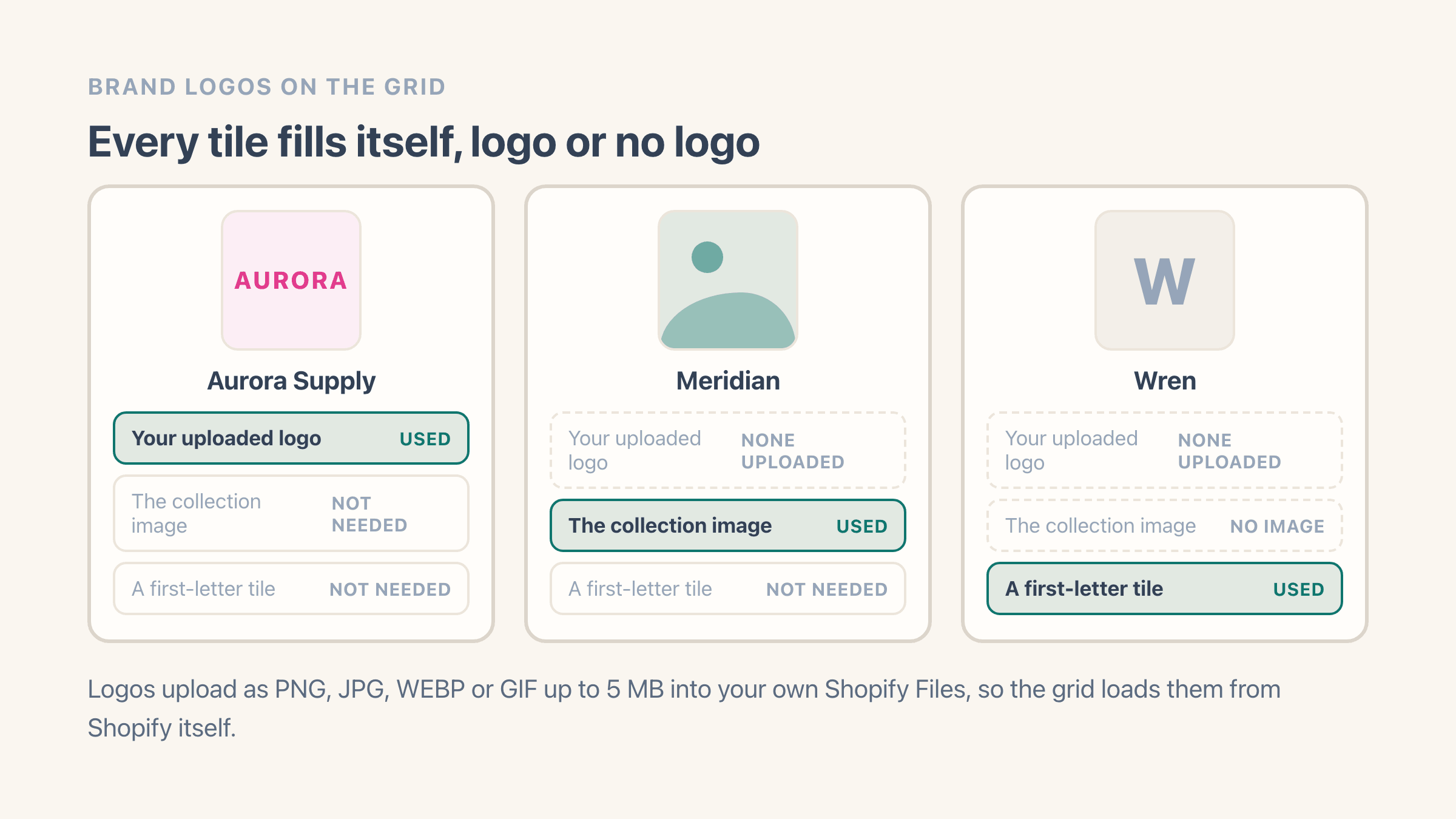
Save the theme to publish the grid. A brand with no uploaded logo falls back to its collection image, and then to a first-letter tile, so the grid never shows a blank cell.
If it does not work
A brand you uploaded a logo for still shows a letter tile. Check it is the same brand row you edited: spelling variants that differ by more than case or spacing are separate brands, so the logo may be sitting on the one your products no longer use.
How to undo it
Click the block in the theme editor and choose Remove block to take the grid off the page. Your uploaded logos stay in your Shopify Files and on their brands.
What you get
- A responsive grid built from the brand logos you upload
- Image cards layout - each logo in a card with the brand name
- Logo wall layout - borderless logo tiles with the names hidden
- Logos saved in your own Shopify Files and loaded from Shopify itself
- Automatic fallback: uploaded logo, then collection image, then a letter tile
- 2 to 6 columns on desktop and 1 to 4 on mobile, with no theme code
Image cards or Logo wall: two grid layouts
Easy Brand Page has two logo-grid layouts. Image cards puts each logo in a soft card with the brand name underneath, and Logo wall shows the logos on their own as borderless tiles with no names.
Image cards suits stores that want the brand name visible next to each logo. Logo wall suits a cleaner, stockist-style wall of logos where the images speak for themselves. Both are one-click presets in the theme editor, and both pull each brand's image the same way.
How does a brand get its logo onto the grid?
Each card shows the logo you upload for that brand. If a brand has no uploaded logo, the grid uses that brand's collection image, and if there is no image either, a clean first-letter tile.
You upload one logo per brand in the app, in PNG, JPG, WEBP or GIF up to 5 MB. The file goes into your own Shopify Files and loads from Shopify itself, so the grid never waits on an outside service and the images stay yours if you ever remove the app. The fallback order means the grid looks complete even before you have a logo for every brand.
How many logos should sit in a row?
Four across on desktop is the default and it suits most catalogues. The block runs from 2 to 6 columns on desktop and 1 to 4 on mobile, and the rule of thumb is that wide wordmarks want fewer columns while small square marks can take five or six without turning into confetti.
Mobile is where people get this wrong. Two columns is the default there and it is usually right, because three columns on a phone leaves each logo about as wide as your thumb. Set the desktop and mobile numbers separately, then look at the page on your own phone before you decide the layout is finished.
The preset sets the card look, and you can recolor the square behind each logo and the brand-name text to match your theme, with a subtle lift on each logo as shoppers hover. It is all done in the theme editor, with no theme code to edit - see the design and layout options for the full list of controls.
What size should a brand logo be?
Anything up to 5 MB, as a PNG, JPG, WEBP or GIF. Pixel size matters less than shape, because every logo is scaled to fit inside its square, so a long wordmark and a small round badge both end up in tiles of the same size.
Transparent PNGs are the files worth chasing your suppliers for. They sit cleanly on whatever color you set behind the tile, while a logo saved on a white background shows its own white box the moment your card color is anything but white. When a brand only sends you a white-background file, crop the empty space tightly around the mark before you upload it - that also stops that one brand looking smaller than everything around it.
Two practical notes. On the free plan, brands past the 30-brand cap are locked for editing until you upgrade, so spend your first hour on the brands that are actually on the page. And if an upload fails with a message asking you to close and reopen the app, do exactly that: Shopify is asking you to approve the permission that lets the app save files to your store, and the upload works straight after.